Of course I've been watching Sandman and it's everything the 19-year-old me always wanted in a Sandman adaption. I'm now 47, but can still cling it that love for a bit.
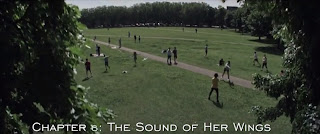
There's a lot going on in the series - and a lot to think about on the merits of such a exact adaption - but I was weirdly put off by the font they used for the chapter headings. With both comic and TV show trading so hard on the the Dave McKean aesthetic, (and even getting big Dave to do the end credits things), to have chapter headings that look like something from a power-point presentation is just really odd.
This is, obviously, a fucking stupid thing to be bugged by, but I'm still bugged by it. The appeal of Sandman was always when it embraced its pretensions with all its goth heart, and leaned into it as much as possible. Something so tasteful just doesn't fit in.


No comments:
Post a Comment